


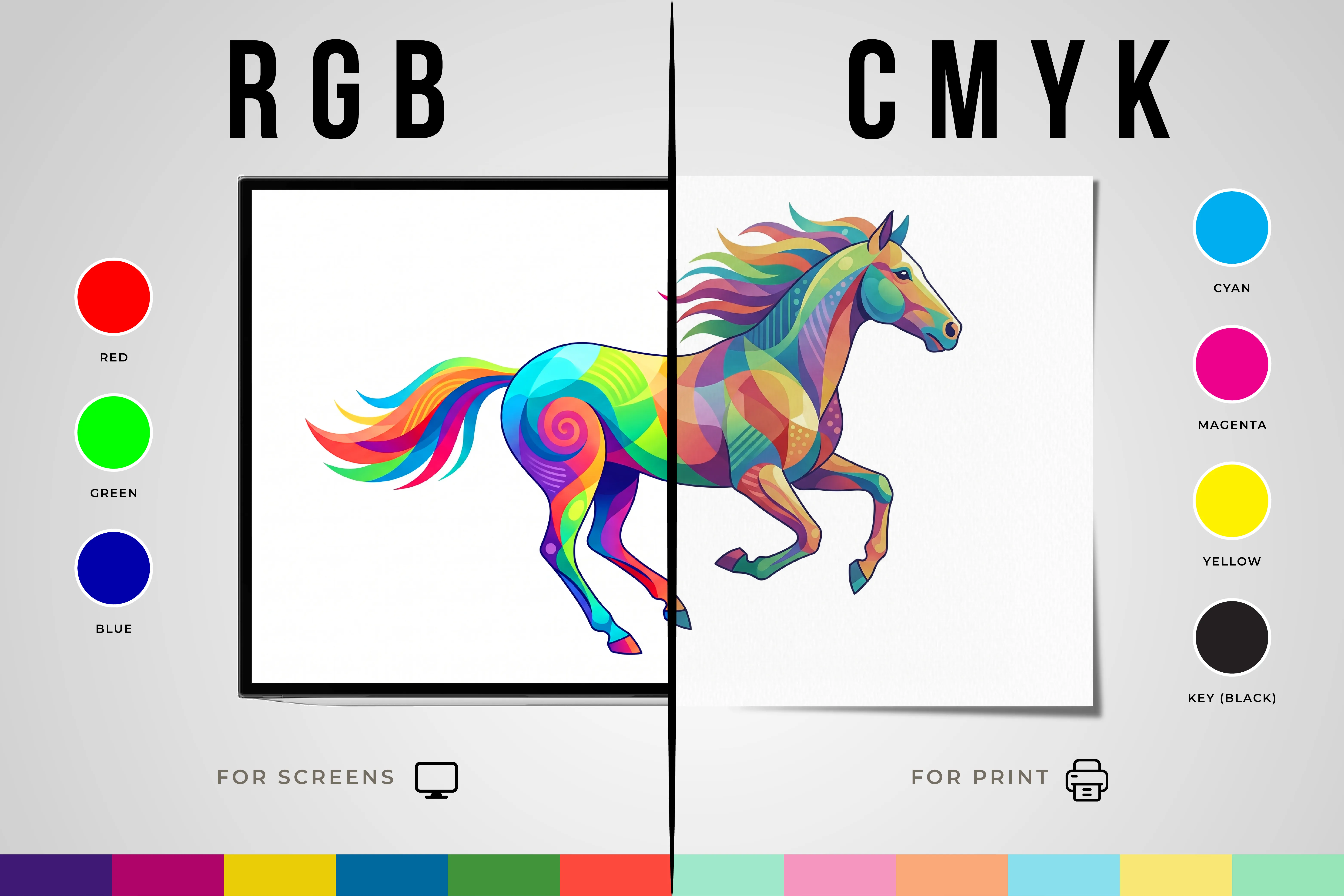
What Is the Difference Between RGB and CMYK?
Have you ever designed something on your computer only to discover that the printed version looks completely different? You’re not alone.
It’s one of the most common challenges in design and printing. A vibrant blue on your screen suddenly appears muted on paper, while bright greens and reds lose some of their intensity. The reason behind this isn’t poor printing, it's the difference between RGB and CMYK.
Understanding these two color models can help you avoid costly mistakes, maintain brand consistency, and achieve better results across both digital and printed materials. Whether you’re creating a logo, brochure, business card, social media graphic, or product packaging, knowing when to use RGB or CMYK is essential.
This guide explains everything you need to know about RGB and CMYK in simple terms so you can confidently prepare your files for both screen and print.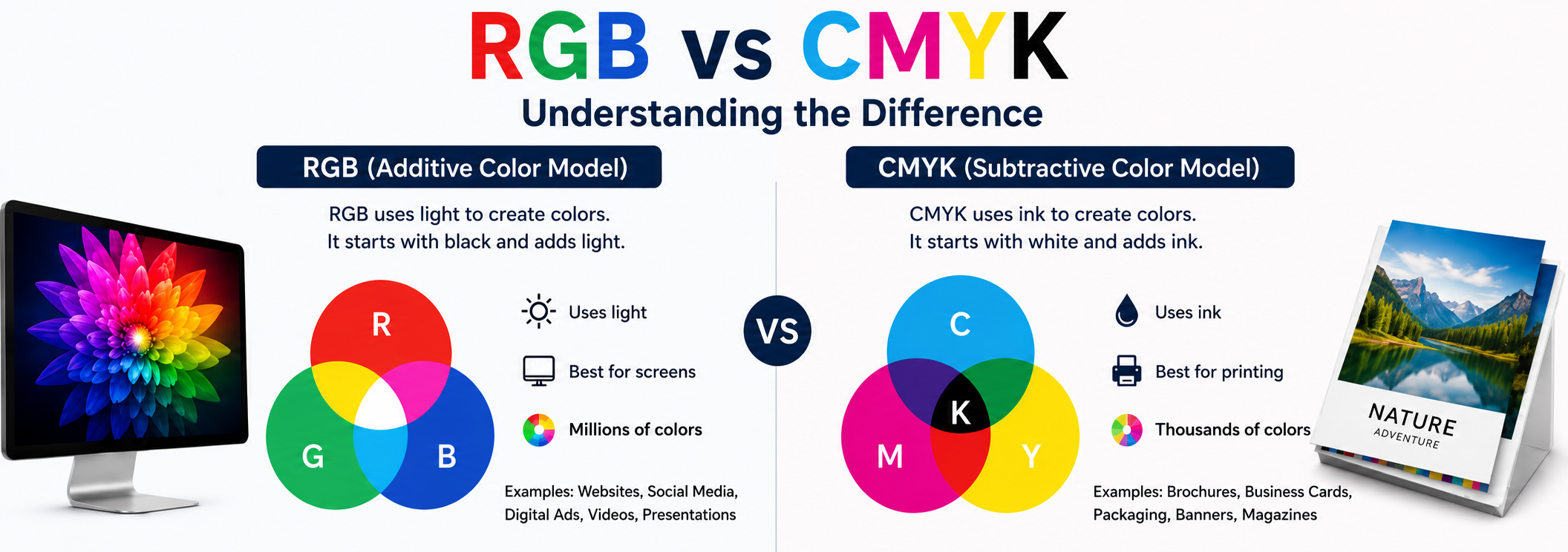
What Is RGB?
RGB stands for Red, Green, and Blue, the three primary colors of light used by digital devices.
Every smartphone, laptop, television, tablet, and monitor uses RGB to display colors. Tiny pixels combine different amounts of red, green, and blue light to create millions of colors on your screen.
RGB is known as an additive color model because colors are created by adding light:
- Red + Green = Yellow
- Red + Blue = Magenta
- Green + Blue = Cyan
- Red + Green + Blue = White
Because RGB uses light, it can produce extremely bright and vibrant colors. That’s why images often look more vivid on a screen than they do when printed.
RGB is the best choice for:
- Websites
- Social media graphics
- Mobile apps
- Digital advertisements
- Videos
- Email campaigns
- Presentations
If your audience will view your design on a screen, RGB is usually the right option.
What Is CMYK?
CMYK stands for Cyan, Magenta, Yellow, and Key (Black).
Unlike RGB, CMYK is designed specifically for printing. It uses ink rather than light to create colors on paper and other materials.
CMYK is called a subtractive color model because each layer of ink absorbs (or subtracts) certain wavelengths of light. As more ink is added, the colors become darker.
Commercial printers use CMYK to produce:
The “K” in CMYK stands for “Key,” which refers to black ink. Black is added because combining cyan, magenta, and yellow alone doesn’t produce a true, rich black.
If your project will be physically printed, CMYK should always be part of your workflow.
How Do RGB and CMYK Work?
Although both are color models, RGB and CMYK work in completely different ways.
RGB starts with black and adds light to create colors. The more light you add, the brighter the image becomes.
CMYK starts with white paper and adds ink. The more ink you apply, the darker the result becomes.
This is why digital screens can display glowing blues, neon greens, and highly saturated reds that are difficult or sometimes impossible to reproduce in print.
Think of it this way:
RGB creates color using light.
CMYK creates color using ink.
That single difference explains why the same design can look dramatically different depending on where it’s viewed.
Why Do Colors Look Different on Screen and in Print?
This is the question most designers, marketers, and business owners ask. The answer is simple: screens emit light, while printed materials reflect light.
When you look at a monitor, you’re seeing light projected directly into your eyes. Printed materials rely on surrounding lighting conditions, such as sunlight, office lighting, or indoor lamps.
Other factors also affect printed colors, including:
- Paper type
- Ink quality
- Printer calibration
- Finishing techniques
- Viewing environment
For example, a brochure printed on glossy paper will usually appear brighter than one printed on uncoated paper.
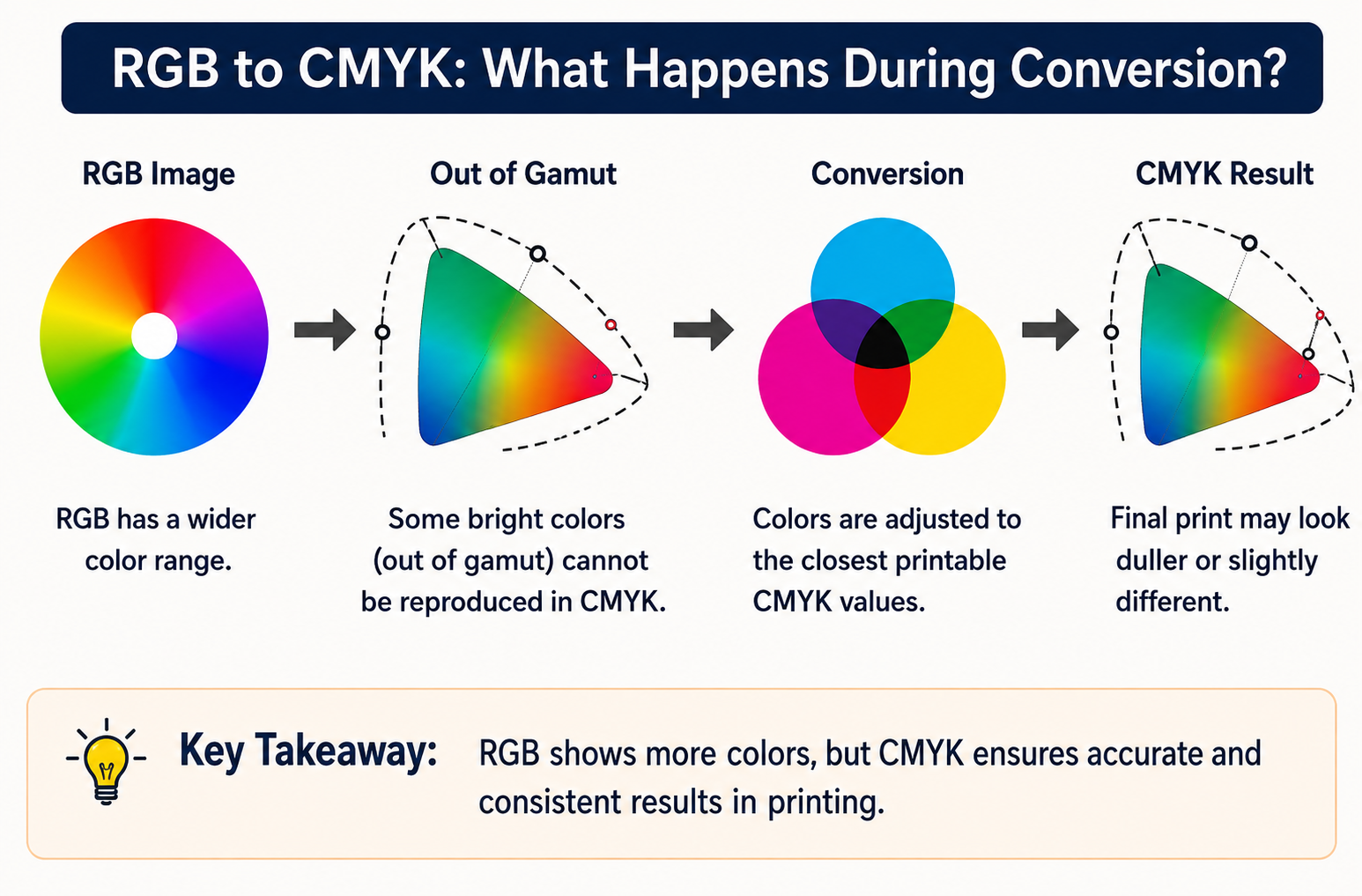
Because RGB has a larger color range than CMYK, some colors simply cannot be reproduced exactly in print. Bright neon colors, electric blues, and fluorescent shades are among the most common examples.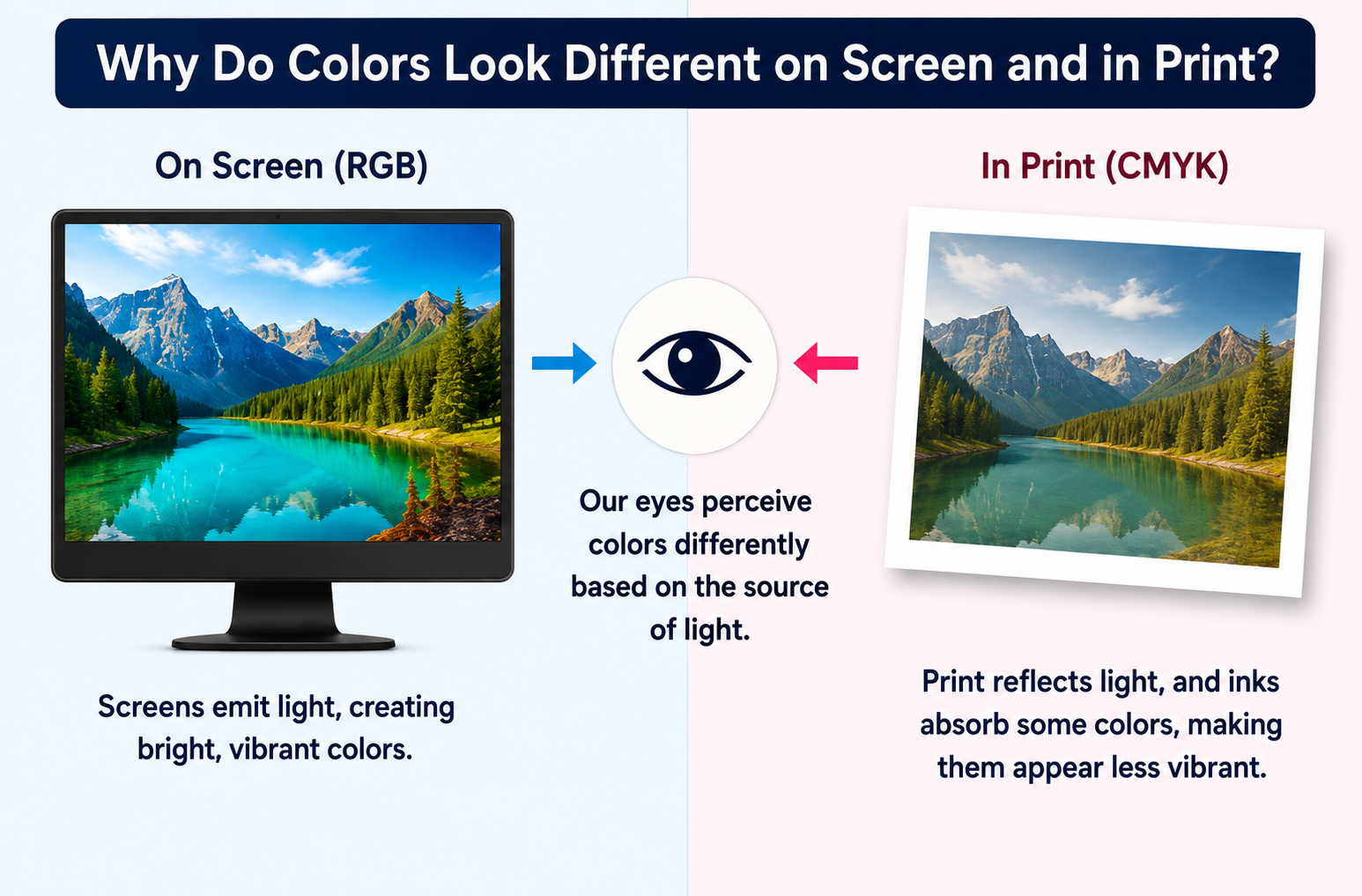
When Should You Use RGB?
Use RGB whenever your content is intended for digital viewing.
RGB offers a wider color gamut, making it ideal for projects that need to look vibrant on screens.
Choose RGB for:
- Website designs
- Social media posts
- Online advertisements
- YouTube thumbnails
- Mobile applications
- Digital presentations
- Email marketing campaigns
Professional photographers also work in RGB because cameras capture light rather than ink.
If your design will never leave the digital world, RGB is the best choice.
When Should You Use CMYK?
Use CMYK whenever your design is intended for commercial printing.
Starting your project in CMYK helps you see a more realistic representation of how your colors will appear after printing. Waiting until the last minute to convert your files can lead to unexpected color shifts.
CMYK is recommended for:
- Business cards
- Flyers
- Brochures
- Booklets
- Custom Signs & Banners
- Custom Vehicle Graphics
- Trade Show Displays
Designing in CMYK from the beginning helps reduce revisions and improves color consistency across all printed materials.
Can You Convert RGB Files to CMYK?
Yes, but conversion isn’t always perfect. When you convert RGB to CMYK, your design software replaces colors that fall outside CMYK’s printable range with the closest available alternatives.
This can result in:
- Less vibrant colors
- Slight hue changes
- Reduced saturation
- Altered gradients
Programs like Adobe Photoshop, Illustrator, and InDesign
allow you to convert files
using professional color
profiles for better accuracy.
Before printing, it’s a good idea to:
- Convert the file to CMYK.
- Review all colors carefully.
- Check gradients and photographs.
- Request a proof from your printer.
The earlier you convert your files, the easier it is to make adjustments before production begins.
What Happens If You Print an RGB File?
Printing an RGB file without conversion can lead to disappointing results.
Some common problems include:
- Dull or faded colors
- Unexpected color shifts
- Inconsistent branding
- Poor black reproduction
- Differences between print runs
For example, a bright blue logo may print as a muted purple, while a vibrant green could appear olive.
Most printers automatically convert RGB files to CMYK before printing. However, automatic conversions don’t always produce predictable results.
That’s why professional designers prefer to manage the conversion process themselves instead of leaving it to the printer’s software.
How Can You Avoid Common RGB and CMYK Mistakes?
A few simple practices can save time, money, and frustration.
Here are some of the most effective ways to avoid color issues:
- Use RGB for digital projects.
- Use CMYK for print projects.
- Convert files before submitting them for printing.
- Use high-resolution images (300 DPI or higher).
- Calibrate your monitor regularly.
- Request printed proofs for important projects.
- Use the correct ICC color profiles.
- Communicate with your print provider early.
Professional printing is as much about preparation as it is about production. The better your files are prepared, the better your final product will look.
Conclusion: What Should You Remember About RGB and CMYK?
RGB and CMYK may sound like technical terms reserved for designers and print professionals, but understanding the difference between them can have a major impact on the success of your projects. RGB is designed for digital screens, while CMYK is the industry standard for producing accurate, high-quality printed materials.
Choosing the right color mode from the start helps eliminate unexpected color shifts, maintain brand consistency, and ensures your designs look exactly as intended.
The next time you're preparing artwork for a brochure, business card, banner, packaging, or social media campaign, ask yourself one simple question: Will this be viewed on a screen or in print?
Your answer will determine whether RGB or CMYK is the right choice.
At All Seasons Printing, we know that exceptional printing is about more than putting ink on paper it's about bringing your vision to life with precision and consistency. Using advanced printing technology, premium materials, and a commitment to color accuracy, our team delivers outstanding results across every project, from marketing materials and signage to large-format graphics and custom printing solutions. Every job is handled with care, efficiency, and attention to detail to ensure your brand makes a lasting impression.
Whether you need vibrant business cards, eye-catching banners, or professionally printed promotional materials, All Seasons Printing in Joplin, Missouri is dedicated to producing premium-quality color work that exceeds expectations on time and with complete confidence in every print.
Frequently Asked Questions
Common questions about RGB, CMYK, and preparing files for print.
Neither is better. RGB is ideal for digital content, while CMYK is designed for printing.
No. RGB has a larger color gamut, which means some screen colors cannot be accurately reproduced using CMYK inks.
Screens emit light, while printed materials reflect light. This naturally makes digital colors appear brighter.
Ideally, businesses should maintain both RGB and CMYK versions of their logos to ensure consistency across digital and printed materials.
Yes. Glossy, matte, coated, and textured papers all affect how colors appear after printing.
Need Help Preparing Your Files for Print?
All Seasons Printing can help make sure your artwork is set up correctly for professional printing and consistent color results.
Request a Quote