


How to Design Effective Business Cards That Get Noticed
Business Card Design & Printing Guide
A business card may be small, but it can shape how people remember your business. Whether you meet a potential customer, attend a networking event, or introduce your services, your card should communicate essential information quickly and professionally.
Effective business cards do more than display a name and phone number. They reflect your brand, establish credibility, and give people a convenient way to reconnect. This guide explains how to design effective business cards with 12 practical tips, common mistakes, printing specifications, and industry examples.
What Makes a Business Card Design Effective?
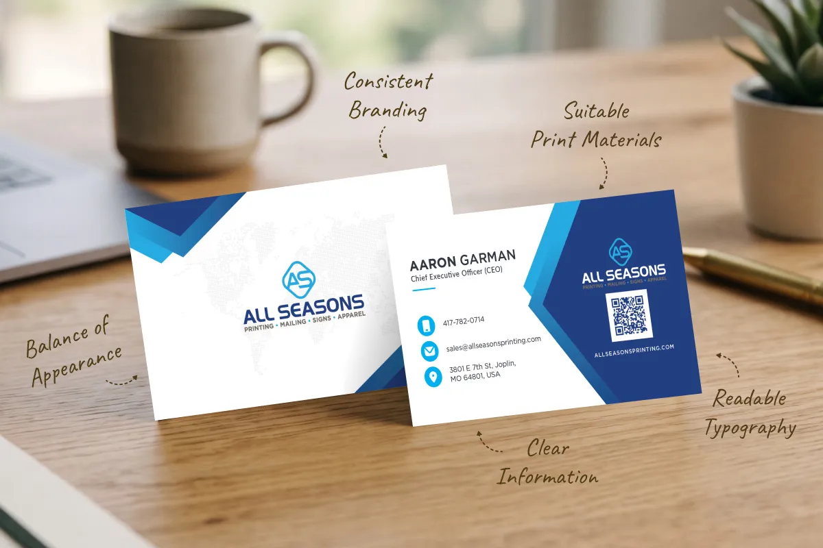
An effective card helps someone understand who you are, what you do, and how to reach you without searching through unnecessary details. Good designs balance clear information, consistent branding, readable typography, thoughtful spacing, and suitable print materials.
Imagine two cards from local contractors: one contains a long service list and tiny contact text; the other shows a recognizable logo, a clear phone number, and a website. The second is generally easier to use because it prioritizes the details customers need.
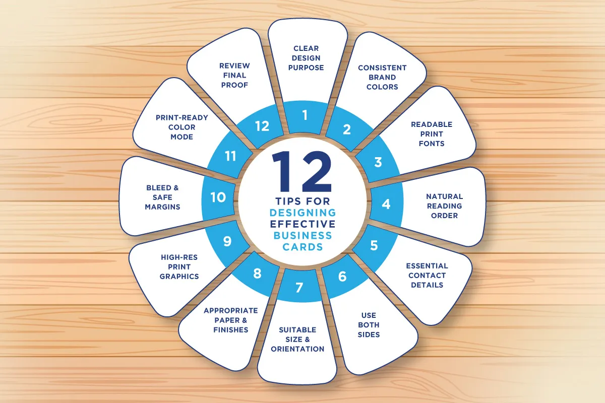
12 Tips for Designing Effective Business Cards
1. Start With a Clear Design Purpose
Before choosing colors or fonts, decide what your business card needs to accomplish. A contractor may prioritize a direct phone number, while a photographer may want to lead visitors to a portfolio.
Think about who will receive the card, which information they need first, and what action you want them to take. Give that information the strongest emphasis.
2. Use Brand Colors Consistently
Your business card should look like a natural extension of your logo, website, signage, and other marketing materials. Use a restrained palette with sufficient contrast between text and background.
Screen colors may not reproduce exactly in print. For brand-critical colors, ask your printer about color profiles and appropriate proofing.
3. Choose Readable Fonts and Appropriate Text Sizes
Decorative typefaces can add personality, but contact details must remain legible at the finished size. One or two complementary font families are usually enough.
As a starting point, try 10–14 pt for names, 8–10 pt for job titles and contact details, and 8–9 pt for secondary information. These ranges are guidelines rather than fixed rules. Actual legibility depends on font design, weight, contrast, and print quality. Print a full-size sample before ordering.
| Text element | Suggested starting size |
|---|---|
| Name | 10–14 pt |
| Professional title | 8–10 pt |
| Phone, email, website | 8–10 pt |
| Secondary details | 8–9 pt |
4. Organize Information With a Clear Visual Hierarchy
Make the business name or logo, personal name, and primary contact details easy to locate. Use size, weight, alignment, and spacing to establish a natural reading order.
White space is useful: it separates information and makes the card feel intentional. Do not give every element equal emphasis.
5. Include Only Essential Contact Information
Choose the contact methods your audience will actually use: your name, business name, phone number, email, website, and—when relevant—physical address or QR code.
A local retailer may benefit from displaying its address, while a consultant may prioritize a direct email and website. Use a professional email address when possible, and remove unnecessary details instead of shrinking important text.
6. Use Both Sides Strategically
Double-sided cards can place primary contact information on the front and supporting details, a tagline, or a QR code on the back. This creates more space without crowding the main design.
A single-sided card can be just as effective, especially when you want a minimalist look or a blank area for handwritten notes.
7. Choose the Right Size and Orientation
A standard finished U.S. business card measures 3.5 × 2 inches. Horizontal cards are familiar and practical; vertical or square cards can be distinctive but may be harder to store.
Confirm the availability and cost of custom shapes or dimensions before finalizing artwork. A memorable design should still be convenient to carry.
8. Select Paper Stock and Finishes That Match Your Brand
Matte finishes generally reduce glare, while glossy finishes can make colorful artwork appear more vibrant. Uncoated cardstock has a natural feel and is often better for writing notes. Thicker stock can create a more substantial impression.
Foil stamping, embossing, debossing, and spot UV may highlight selected elements where supported. Stock specifications such as 14 pt or 16 pt describe approximate thickness (caliper), not paper weight; ask your printer which stocks and finishes are available.
9. Use High-Resolution Images and Vector Logos
For standard commercial printing, a raster image generally benefits from an effective resolution of around 300 pixels per inch (PPI) at its final printed size. Vector logos are especially useful because they scale without pixelation.
Print-ready PDFs often preserve layout, embedded fonts, and vector elements. Check accepted file formats with your printer, avoid stretching logos, and ensure linked images are high quality.
For a deeper explanation, see Raster Image vs. Vector Image.
10. Understand Bleed, Trim Size, and Safe Margins
Bleed is artwork extending beyond the final cut edge. Trim size is the finished card dimension, and the safe area is where essential text and graphics should remain inside the trim.
For a 3.5 × 2-inch card with 0.125-inch bleed on all sides, the total artwork size is 3.75 × 2.25 inches. Keeping important text at least 0.125 inches inside the trim edge is a useful starting point, although some designs require more clearance. Always follow your printer’s actual template.
| Specification | Example dimensions |
|---|---|
| Finished trim size | 3.5 × 2 in |
| Bleed on each side | 0.125 in |
| Artwork including bleed | 3.75 × 2.25 in |
| Example interior safe margin | 0.125 in |
11. Prepare Colors for Professional Printing
Screens commonly use RGB light, while many commercial printing processes use CMYK inks. Some vivid screen colors cannot be reproduced identically in print, and the paper stock can also affect the result.
Do not automatically convert every file without checking the production workflow. Your printer may request CMYK, RGB with managed conversion, or spot colors. A digital proof helps check content and layout but may not accurately represent paper texture or final printed color.
12. Review the Final Proof Before Printing
Check names, phone numbers, email addresses, URLs, logo proportions, typography, contrast, trim, bleed, and both sides of the design. Review artwork at actual print size, and have another person check contact details if possible.
If you include a QR code, scan a physical sample with more than one phone. Confirm the final file version, material, finish, and quantity before approving production.
Common Business Card Design Mistakes to Avoid
Even attractive business cards can fail when design choices interfere with usability. These are the mistakes worth checking before print approval.
- Overcrowding: Move extra information to your website rather than shrinking essential text.
- Small or low-contrast type: Test readability at actual size and use a clear foreground/background contrast.
- Low-resolution graphics: Use suitable raster images and vector logos where possible.
- Missing bleed: Extend edge-to-edge backgrounds beyond trim and keep contact details inside the safe area.
- Untested QR codes: Provide a quiet zone and scan a physical sample.
- Unverified details: Proofread phone numbers, URLs, names, and the final approved file.
Business Card Design Ideas for Different Industries
Different audiences have different priorities. The examples below are starting points, not fixed rules.
| Industry | Design approach | Useful feature |
|---|---|---|
| Real estate | Clean branding and prominent contact details | QR code linking to listings |
| Construction | Bold, legible type and recognizable branding | Direct phone number |
| Healthcare | Simple, easy-to-read layout | Office and appointment information |
| Creative agencies | Distinctive but organized layout | Portfolio website |
| Restaurants | Recognizable colors and concise information | Menu or reservation link |
| Professional services | Restrained colors and strong hierarchy | Name, title, direct contact |
| Retail | Memorable branding | Website or store location |
Should You Use a QR Code on a Business Card?
A QR code can connect the card to a portfolio, booking page, contact form, or digital business card. It should complement—not replace—essential contact details. Maintain sufficient clear space and contrast around the code.
For a simple QR code, approximately 0.8–1 inch square may be a useful starting point, but the required size depends on the encoded data, contrast, print quality, and scanning distance. Test a physical proof before approving a full run.
Business Card Design Checklist Before Printing
- Brand colors and logo are consistent.
- Contact information is correct.
- Text is legible at actual size.
- Visual hierarchy is clear.
- Finished size matches the order.
- Bleed and safe margins are correct.
- Images have adequate resolution.
- Color setup follows printer guidance.
- QR code scans correctly.
- Paper and finishing are confirmed.
- Both sides have been reviewed.
- Final proof and file version are approved.
Conclusion
Designing an effective business card requires thoughtful decisions about information, branding, readability, materials, and print preparation. A clear layout, readable typography, and accurate print preparation help create a card that looks professional and is genuinely useful.
For businesses in Joplin and throughout Southwest Missouri, All Seasons Signs and Printing offers business card printing options to help turn a well-prepared design into a finished marketing piece.
Ready to Print Your Custom Business Cards?
Explore available business card printing options and choose a format that suits your brand.
Explore Business Card PrintingFrequently Asked Questions About Business Card Design
What should an effective business card include?
Include your name, business name, and essential contact information. Add a title, logo, website, or QR code only when useful.
What is the standard business card size?
In the United States, a standard finished business card is 3.5 × 2 inches.
What is the best font size for a business card?
Contact information often works well around 8–10 pt, depending on the typeface. Check legibility at actual print size.
Should business cards be matte or glossy?
Matte reduces glare; gloss adds shine. Choose based on branding, artwork, and whether customers need to write on the card.
How much bleed should a business card have?
A common example is 0.125 inches on each side, but always follow the printer’s specific requirements.
Should I print on both sides?
Use both sides if you need extra room for branding, a QR code, or services. A single-sided design can be equally effective.
What file format is best for printing?
A properly prepared print-ready PDF is commonly preferred because it can preserve fonts and vector artwork. Follow your printer’s file specifications.
Is 300 PPI necessary for business cards?
Around 300 PPI at final size is a common target for raster images. Vector artwork is ideal for logos and line graphics.
Should I include a QR code?
Include one if it provides a useful destination. Maintain contrast and a clear quiet zone, and test the printed code.
What is the most common business card design mistake?
Overcrowding the card with too much information is a frequent problem. Prioritize readable essentials.
How can I make a business card stand out?
Use consistent branding, clear hierarchy, thoughtful spacing, and materials that suit your business.
How do I prepare artwork for professional printing?
Confirm dimensions, bleed, safe margins, image resolution, color settings, file format, and the final proof.
